Strategic Intelligence Platform
VizBoard:
The starting point: curiosity
I wanted to understand the current fintech market, how they evolve from startups, not just in charts, but in the sequence of events around it.
Funding rounds.
Product launches.
Regulatory roadblocks.
Expansion announcements.
Out of curiosity, I started collecting public data from:
company websites
press releases
major news outlets
I used R Shiny (weird choice, I know) to visualise timelines and patterns. It worked…kinda.
But it quickly hit its limits.
The problem
R Shiny gave me charts, but not clarity.
In a fast-moving industry, information is distributed across countless sources, and staying up to date is essential.
The setup was:
manual (every update depended on me)
static (the market isn’t)
good at showing what happened, not what it signalled
I wanted something that could:
Update continuously
Surface patterns quickly
Help me interpret growth from different angles, in one place
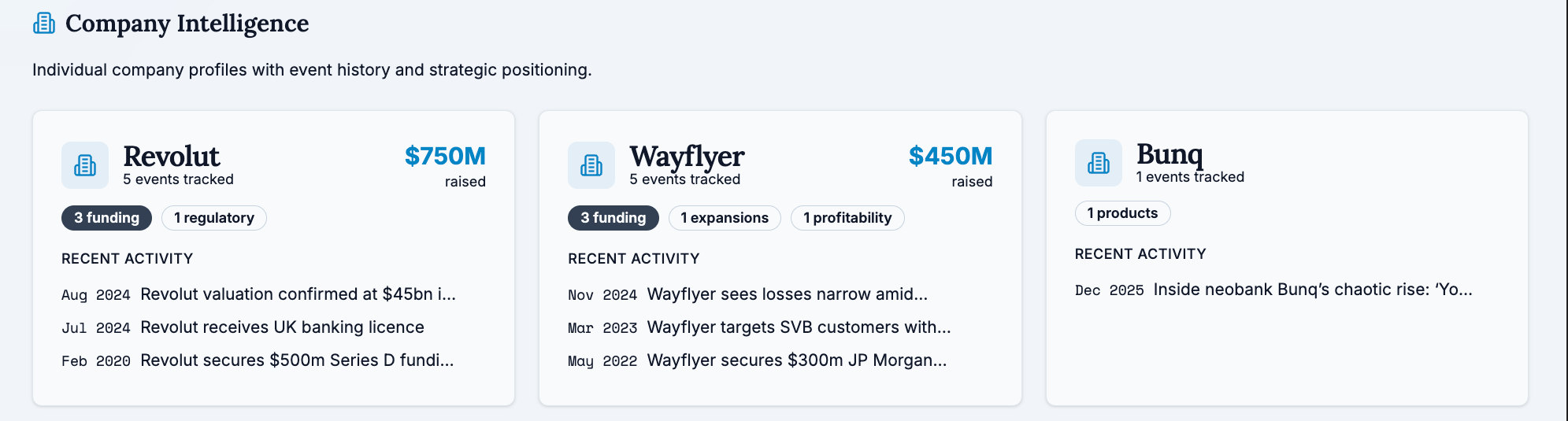
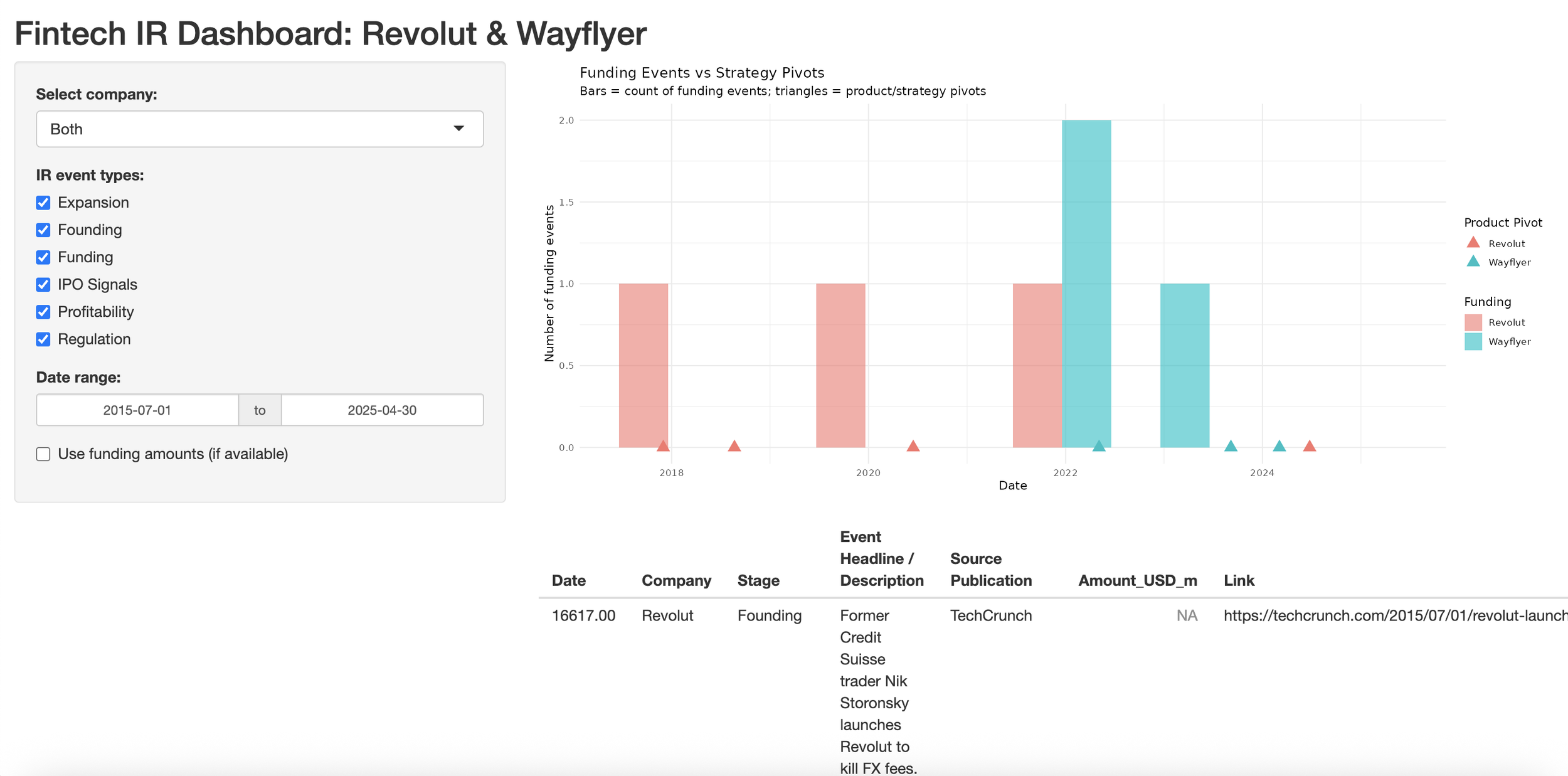
What’s happening (Timeline)
Growth only makes sense in sequence.
So I rebuilt the project around a single, continuous timeline:
funding rounds
launches
expansion
regulatory moments
All in one view, so growth reads like a story, not a stream of headlines.
This became the backbone of the product.
Why it matters
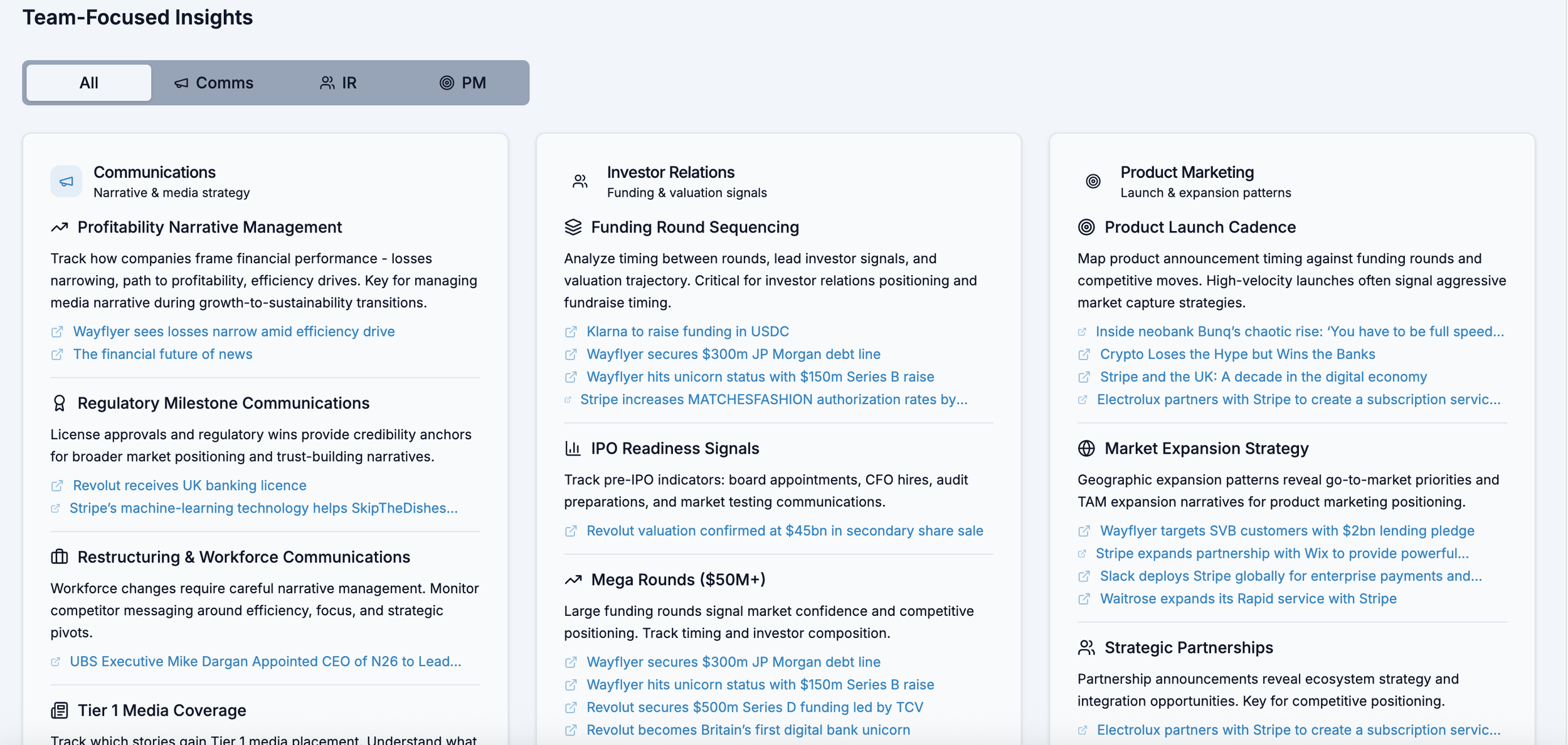
The same events answer different questions depending on who’s looking:
Comms & PR → credibility, narrative momentum
Investor Relations → readiness, valuation signals
Product & PMM → launch timing, competitive intent
Most tools pick one audience.
I didn’t believe that reflected how teams actually work.
So the system shows one shared dataset, reframed through multiple lenses, without duplicating data or context.
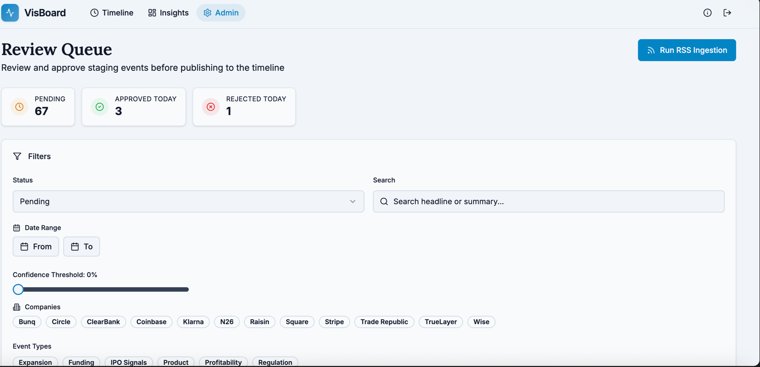
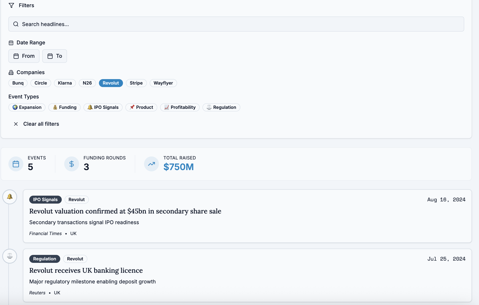
How it works (and why it’s trustworthy)
It’s not a dumping ground of info from all over the internet...
Only reputable public sources and official company pages are used
Every event is human-reviewed and approved by the admin
Each insight links back to its original source for double-checking
AI helps summarise and cluster patterns.
But judgment stays human.
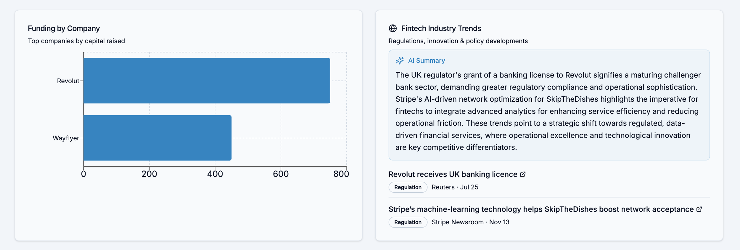
What it signals (Insights, not noise)
Once the data is structured and trustworthy, patterns start to appear:
How profitability is framed during downturns
When a product launches appear
How regulatory moments unlock broader narratives
The dashboard doesn’t predict the future,
It helps teams see context and notice patterns instead of guesswork.
Why I built this?
Working cross-functionally showed me that teams don’t work in silos but most tools still assume they do.
This was built to replace isolated updates with shared context, so teams can move faster and with more confidence, supported by context.